Monday, July 9, 2007

(Dodgy) Plan: 9th July

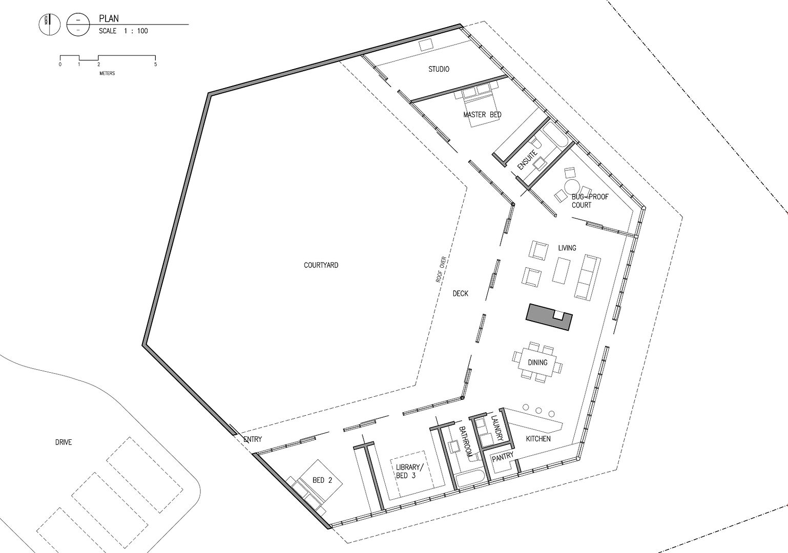
As Lily and I were discussing yesterday, what we've set up here is not the conventional 'architect-client' relationship where I 'sell' my designs on you, but a collaboration. So ordinarily this would go straight in the bin, but I know you won't freak out and think I've lost it, so here it is. And just in case you are, read this big disclaimer:

DON'T WORRY, I KNOW IT'S CRAPPIER THAN BEFORE, I HAVE ALREADY MOVED ON.

Then again, maybe you like it?

Saturday, July 7, 2007

Le Corbusier on 'plans'

"To make a plan is to determine and fix ideas.
It is to have had ideas.
It is so to order these ideas that they become intelligible, capable of execution and communicable. It is essential therefore to exhibit a precise intention, and to have had ideas in order to be able to furnish oneself with an intention. A plan is to some extent a summary like an analytical contents table. In a form so condensed that it seems as clear as crystal and like a geometric figure, it contains an enormous quantity of ideas and the impulse of an intention."
- Le Corbusier, Towards a New Architecture, 1923
I thought this was a really nice quote that fits well with your response to seeing the plan. The thing that pleased me the most about your comments was not that you liked it - which of course is great- but that you understood what it meant without my needing to explain it. I was amazed at how accurately you understood the subtlety of what i was trying to get across just through the arrangement of lines on a page, and that those lines could summarise so much of our ongoing conversation.

Wednesday, May 9, 2007

FYI: Primary School, Gando, Bukina Faso

Hey is this near to where you were in Africa? The villiage is called 'Gando', it's 200kms from Ouagadougou in Bukina Faso. It's a project by Diébédo Francis Kéré, an architect actually from Gando, who then studied in Germany and has now returned to work on community projects for his villiage. It popped up in the high-brow archi-mag UME 21. I reckon its super awesome; local materials and building techniques for an environmentally sustainable outcome, but with really modernist planning.

Tuesday, May 1, 2007

'Shifting' materiality theme

I've been thinking about this subtle shifting brick wall and how that idea might be translated throughout the house using other materials like paving or timber lining to the walls or ceiling. My only reservation at this stage is it's a fine line between wacko and elegant when things start to get wonky...

Saturday, April 28, 2007

Tennis court dimensions

Official measurements from the Court and Enclosure Dimensions pdf on the Tennis Australia website. Minimum Total Playing Area (that's TPA for those in the biz) is 35.75m x 17.07m. And preferably oriented North-South. What surface were you thinking club champ?

Wednesday, April 25, 2007

Glazing as scaled up brick pattern

I liked this scaled-up stretcher-bond pattern in this glazing by the short-lived student practice Architecture Group from New Zealand. Rothingham house, 1951.

Precedent: MacIntyre's Coil House, 1953

On this side of the world, also in 1953, Peter MacIntyre designed this courtyard-ish house, which, similarly to Aalto's summer house, responds to the landscape by cascading down the slope and avoiding a few big gums. Lily and Martin both picked out this one from the Monument 'Classic Houses' issue.

Precedent: Aalto's summer house, 1953

Aalto's own summer retreat house in Muuratsalo, Finland, designed in 1953. Similarly to a lot of the other precedents, this house is a semi-courtyard house, with the rooms arranged in an L shape around a brick courtyard. Aalto used this house to create an essay in ways to compose bricks; different bonds, grout depths, tiles, etc. Richard Weston describes this house as "by comparison with conventional summer-houses, both traditional and contemporary, the design is remarkably introverted. The rooms have small windows and the normally direct relationship to nature is mediated by the courtyard, which defines a man-made place within the forest..."

LandVic Maps

From far to close, these (feint) drawings are from the LandVic Interactive Map, a government database which collects all the Australian property and title information. They have 10m contours, which are pretty vague but good for putting together a terrain model of the surrounding hills. Combined with the survey which will have much more detailed level information we can the accurately determine what views are possible from what parts of the site.

Sketches

Tuesday, April 24, 2007

Views from house site

Looking east across adjacent field.

Panorama from north round to west from on top of car where house might sit. The surrounding hills can be

Looking north over adjacent valley. Photo taken from north-west corner of site above road.

Up.

Weird tree

I wonder how you could use this mid-growth-conjoining tree near the site as a starting point for architecture? You probably wouldn't want to on second thought. Too weird and a bit creepy. Like an ingrown toenail.

Details, textures and nature on site

Photos from site visit in April '07.

Position of house on site

The white box indicates where the house is to go as discussed at the site visit. Quite a few trees will need to be lopped, but hopefully they'll be good views from that spot. We'll be able to test that with the survey and a detailed site model. Photos are from the site visit in April '07.

Looking south-east from road near creek crossing.

Looking west from approach access onto site.

Looking west from centre of site.

Looking north-east from field west of site, close.

Looking north-east from field west of site, far.

Thursday, April 12, 2007

PRIVATISATION

Everythings bloody privatised these days! I saw on the news just this morning that in Qld the cost of water has been put up by 15%, not because people are using too much, but because they're being good greenies and not using enough! making the water company lose money.

So I know it's a bit annoying, but now I've even privatised this blog, as soon the work on it will become a bit more sensitive. Now only 'registered' users will be able to view it and make comments. As the 'administrator', I'm the only one who can do the inviting, so if there's someone you want to show the blog to, send me their email address and i'll have them on here STAT.

Monday, March 26, 2007

Precedent: Rogers House, Wimbledon

Thanks to Matt's comment on the Free David Hicks post for pointing me to the Stories of Houses blog, and particularly to this early house by Richard Rogers. I like the plan because its kind of ambiguous as to whats inside and whats out. As far as I can work out, its two pavilions sitting on a paved plinth - but in reference to this discussion on courtyard houses, what is cool is if you invert that you get one big continuous house with two courtyards cut out of it.

Images: Richard Rogers, Dr. Rogers House, 1968-69

Tuesday, March 6, 2007

Free David Hicks!

That's so weird, i just made that same Guantanamo gag half an hour ago about this proof shot of a house we've just finished in Drysdale... And this is what the rest of it looks like if you're interested. I didn't work on it mind you.

Images: BKK Architects, Balla House, Drysdale, 2007

Monday, March 5, 2007

Familiar


When I saw this (David Hicks' Cell) in the paper on the weekend it seemed strangely familiar. I realised it bore strong similarities to the built in minimal bedrooms of the original Lily Cube design.

Wednesday, February 28, 2007

Bored!

Ok I can tell everyone's getting bored of precedents, I know I am, but I've got a scheme cooking at the moment, which I'm not yet ready to go public with. I've got to get it out soon though, as the ideas have woken me up at 3am the last 3 nights and won't let me sleep until I've drawn them up.

But on the other hand, maybe I shouldn't do anything until I've been to the site?

Materiality: Salk Institute, Louis Kahn

I love this combination of timber and concrete. Of course this is in-situ ashen concrete and probably maple wood, you could probably fake it with ply and cement bricks to get that beautiful combination of colour and textures.

Images: Louis Kahn, Salk Institute, La Jolla California, 1969-74

Precedent: Holy Trinity Lutheran Church, Frederick Romberg

This is the perfect example of all architecture needs to be. Square plan, elegantly squat roof and spire, basic but good quality materials, beautifully simple detailing (notice how the roof is held up by fine steel columns which are pulled off the corners to let the domestic timber window frames run past), a wonderful setting, and a warm soft light in the interiors.

Images: Frederick Romberg, Holy Trinity Lutheran Church, Canberra, 1961-63